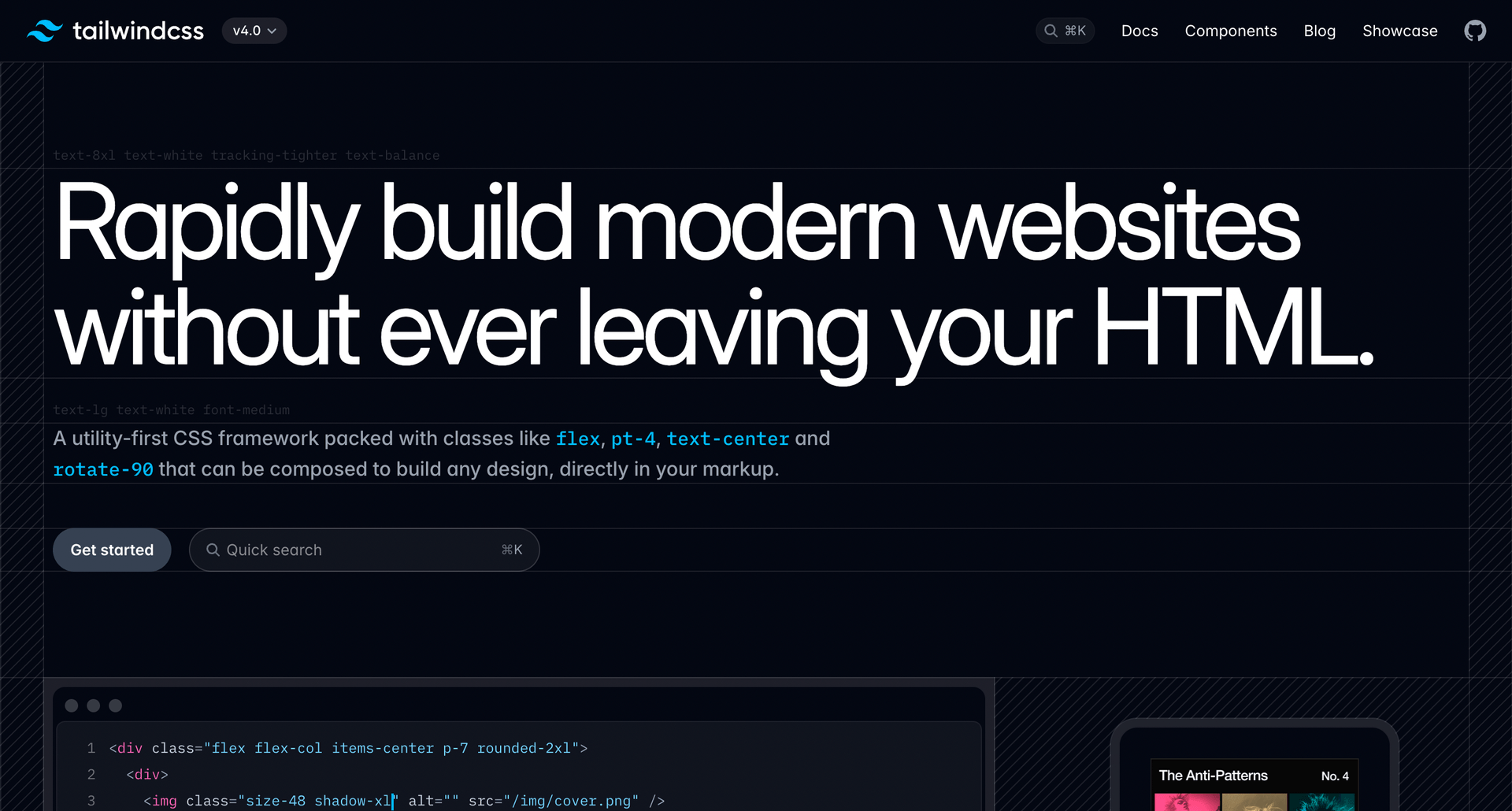
Both Tailwind CSS v3 and v4 is a powerful utility-first framework that enables rapid UI development. We are currently migrating to v4 to take advantage of it’s features, we publish this guide for further reference that provides an in-depth look at its compatibility, integration with key tools, and practical examples to help developers harness its full potential*.
Safelisting desired classes for performance
To set the safelisted classes due to the optimisation explained below use the safelist attribute described below and pass an array of classes.
*Have in mind, that for maximum performance the classes need to be present first in the frontend for them to work, as the post-css plugin removes the unused classes during build time and they won’t be working. Configure your post-css to handle Tailwind properly or add desired classes to the theme.
// tailwind.config.js

module.exports = {
  content: [
    "./src/**/*.{js,jsx,ts,tsx}", // Add paths to all your component files
  ],
  darkMode: "class", // Enable dark mode using class
  theme: {
    extend: {
      colors: {
        // You can extend colors for dark mode here
      },
    },
  },
  safelist: ["dark:hover:bg-blue-500","bg-gray-500", "dark:hover:text-gray-200"],
  plugins: [],
};
Browser Support
Tailwind CSS v4 is designed to work seamlessly with modern browsers, ensuring a consistent experience across platforms:
- Supported Browsers: Chrome, Firefox, Edge, Safari
- Not Supported: Internet Explorer (all versions)
Since Tailwind leverages modern CSS features like @layer, :where(), and CSS variables, it requires up-to-date browser environments for full compatibility.
Framework and Library Compatibility
Tailwind CSS v4 integrates smoothly with Gutenberg and various frontend frameworks and libraries. Here’s how it works:
Dark Mode Support
Tailwind CSS v4 natively supports dark mode using the dark: variant. By default, it follows the user’s system preference, but you can also enable class mode for manual control.
HTML & Tailwind Example for Gutenberg editor:
<div class="p-6 rounded-lg shadow-md bg-white dark:bg-gray-900 text-gray-900 dark:text-gray-100">
  <h2 class="text-xl font-semibold dark:text-pink-400">Dark Mode Ready</h2>
  <p class="text-gray-700 dark:text-gray-400">This component automatically adapts to the selected theme.</p>
</div>
JSX Representation for Theme development:
export default function DarkModeCard() {
  return (
    <div className="p-6 rounded-lg shadow-md bg-white dark:bg-gray-900 text-gray-900 dark:text-gray-100">
      <h2 className="text-xl font-semibold dark:text-pink-400">Dark Mode Ready</h2>
      <p className="text-gray-700 dark:text-gray-400">This component automatically adapts to the selected theme.</p>
    </div>
  );
}
To manually control dark mode, add class mode in tailwind.config.js:
module.exports = {
  darkMode: 'class',
};
Example Tailwind Components
Here’s a collection of UI components built using Tailwind CSS v4, fully responsive and dark-mode friendly.
Button Variants
Gutenberg:
<button class="px-4 py-2 rounded-lg font-semibold text-white bg-blue-500 hover:bg-blue-600 dark:bg-blue-400 dark:hover:bg-blue-500">Primary Button</button>
<button class="px-4 py-2 rounded-lg font-semibold text-white bg-gray-500 hover:bg-gray-600 dark:bg-gray-400 dark:hover:bg-gray-500">Secondary Button</button>
<button class="px-4 py-2 rounded-lg font-semibold text-white bg-red-500 hover:bg-red-600 dark:bg-red-400 dark:hover:bg-red-500">Danger Button</button>JSX:
export function Button({ children, variant = 'primary' }) {
  const base = "px-4 py-2 rounded-lg font-semibold text-white transition";
  const variants = {
    primary: "bg-blue-500 hover:bg-blue-600 dark:bg-blue-400 dark:hover:bg-blue-500",
    secondary: "bg-gray-500 hover:bg-gray-800 dark:bg-gray-400 dark:hover:bg-gray-700",
    danger: "bg-red-500 hover:bg-red-600 dark:bg-red-400 dark:hover:bg-red-500",
  };

  return <button className={`${base} ${variants[variant]}`}>{children}</button>;
}
Card Component
Gutenberg:
<div class="p-6 rounded-lg shadow-md bg-white dark:bg-gray-800 text-gray-900 dark:text-gray-100">
  <h2 class="text-xl font-semibold">Card Title</h2>
  <p class="text-gray-700 dark:text-gray-400">This is a sample card description.</p>
</div>JSX:
export function Card({ title, description }) {
  return (
    <div className="p-6 rounded-lg shadow-md bg-white dark:bg-gray-800 text-gray-900 dark:text-gray-100">
      <h2 className="text-xl font-semibold">{title}</h2>
      <p className="text-gray-700 dark:text-gray-400">{description}</p>
    </div>
  );
}
Input Field
Gutenberg:
<div class="flex flex-col gap-1">
  <label class="text-gray-700 dark:text-gray-300">Email</label>
  <input type="text" placeholder="Enter your email" class="px-3 py-2 border rounded-md focus:outline-none focus:ring-2 focus:ring-blue-500 dark:bg-gray-700 dark:text-white" />
</div>JSX:
export function Input({ label, type = 'text', placeholder }) {
return (
<div className="flex flex-col gap-1">
<label className="text-gray-700 dark:text-gray-300">{label}</label>
<input
type={type}
placeholder={placeholder}
className="px-3 py-2 border rounded-md focus:outline-none focus:ring-2 focus:ring-blue-500 dark:bg-gray-700 dark:text-white"
/>
</div>
);
}
ReactFeather Icons (JSX only for now)
This project utilizes ReactFeather, a lightweight and customizable icon library that pairs perfectly with Tailwind. To use it, install the package and integrate icons within your Tailwind-styled components:
JSX Representation:
import { Camera, Heart } from 'react-feather';

export default function IconExample() {
  return (
    <div className="flex gap-4 p-4 bg-gray-100 dark:bg-gray-800">
      <Camera className="w-6 h-6 text-blue-500 dark:text-blue-300" />
      <Heart className="w-6 h-6 text-red-500 dark:text-red-300" />
    </div>
  );
}
Swiper.js – (JSX only for now)
Swiper.js is utilized in this project for building customizable, smooth sliders. Advanced users can leverage Tailwind’s utility classes to fine-tune their Swiper-based components:
JSX Representation:
import { Swiper, SwiperSlide } from 'swiper/react';
import 'swiper/css';

export default function FunkySlider() {
  return (
    <Swiper slidesPerView={3} spaceBetween={20} className="p-4">
      <SwiperSlide className="bg-blue-500 text-white p-6 rounded-xl">Slide 1</SwiperSlide>
      <SwiperSlide className="bg-green-500 text-white p-6 rounded-xl">Slide 2</SwiperSlide>
      <SwiperSlide className="bg-purple-500 text-white p-6 rounded-xl">Slide 3</SwiperSlide>
    </Swiper>
  );
}
Final Thoughts
Tailwind CSS v4 offers unmatched flexibility for modern web development, ensuring compatibility with major tools like ReactFeather icons, Swiper.js, and full dark mode support. By leveraging Tailwind’s utility classes, developers can build responsive, accessible, and scalable UI components efficiently.
Need more examples or help with implementation? Let us know, and we’ll expand this guide further!

